not found فارسی
not found فارسی
not found English

The Art of Harmony: A Comprehensive Guide to Choosing Carpet Colors Based on Furniture and Curtains

The Art of Harmony: A Comprehensive Guide to Choosing Carpet Colors Based on Furniture and Curtains

A Comprehensive Guide to Choosing Carpet Colors Based on Furniture and Curtains

Introduction: The Importance of Color Harmony in Interior Design

In architecture and interior design, a space is more than just a collection of functional objects; it is a canvas that reflects the occupants' emotion, personality, and lifestyle. The three key elements that simultaneously define a space's structure and soul are the carpet (flooring), furniture, and curtains.

The carpet, often the largest fabric surface and frequently patterned, acts as the visual anchor and foundation of the room. Curtains, the boundary between the interior and the outside world, filter the light and add depth with their texture. Finally, furniture, the most important functional element, defines the living area.

A lack of coordination in color and pattern among these three elements can lead to visual clutter and diminish the spatial quality. As emphasized by prominent design publications like Architectural Digest and Elle Decor, color harmony is not a choice, but a necessity in professional design. The smart selection of a carpet color, one that interacts well with the tones of the furniture and curtains, not only elevates the room's aesthetics but also psychologically creates a calm, cohesive, and balanced environment. This guide aims to provide a comprehensive, academic, and design-focused roadmap to achieving this desired color synchronization.

1. Fundamental Principles of Color Theory: The Color Palette as a Roadmap

For any designer or homeowner seeking a professional arrangement, understanding the principles of color theory is vital. These principles form the common language of art and decoration, defining contrast and balance.

1.1. The Color Wheel and Key Relationships

  • Analogous Colors: These colors are next to each other on the color wheel (e.g., blue, blue-green, and green). Using this combination in the carpet, furniture, and curtains creates an unparalleled sense of calm and cohesion, ideal for formal and classic spaces.
  • Complementary Colors:These colors are opposite each other on the color wheel (e.g., blue and orange, or red and green). A bold use of this combination—for example, a navy (dark blue) carpet with orange cushions or curtains featuring orange details—creates a strong, dynamic, and energetic contrast, a popular trend in magazines like Vogue Living for creating dramatic focal points.

1.2. Color Temperature: Visual Warmth and Coolness

  • Warm Tones: Include red, orange, yellow, and their combinations (e.g., mustard, terracotta, lacquer red). Carpets with warm tones create an intimate, cozy, and energetic space. These colors are an excellent choice for north-facing or dimly lit rooms to compensate for the lack of sunlight.
  • Cool Tones: Include blue, green, purple, and their combinations (e.g., turquoise, olive, navy). Cool tones instill a sense of calm, spaciousness, and focus, and are suitable for bright rooms, offices, or spaces aiming for a minimal or Scandinavian style. The basic principle is to either maintain the color temperature (warm carpet with warm furniture and curtains) or introduce a neutral element (like cream or grey) to create balance.

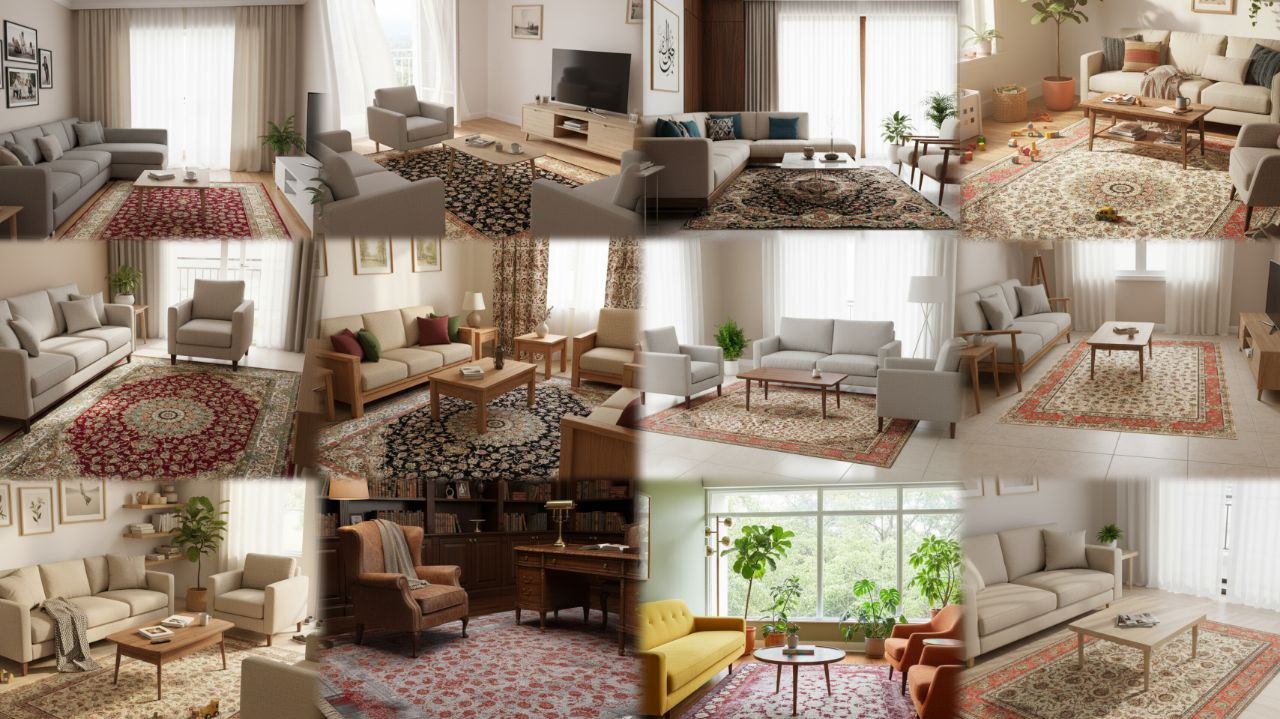
2. Practical Guide: The Triad Harmony of Carpet, Furniture, and Curtains

The decision to choose a carpet color should often be made after the furniture color (especially the main sofa) is finalized, as the carpet is a high-longevity and long-term investment.

2.1. The "60-30-10" Rule and Neutral Elements

Designers at House Beautiful and Better Homes & Gardens often rely on the "60-30-10" Rule: 60% dominant color (walls and carpet), 30% secondary color (furniture and large textiles), and 10% accent color (cushions, artwork, and accessories).

  • The Carpet's Role in this Rule: The carpet can serve as the 60% color, forming the foundation of the color palette. In this case, choosing neutral and timeless colors like light gray, cream, beige, or dove gray for the carpet is a smart decision.
  • The Advantage of Neutral Colors: Neutral colors, especially grays and beiges (which are a 2024 trend), offer the highest adaptability. They act as a "white canvas," allowing you to use energetic colors (such as emerald green, cobalt blue) in the furniture and curtains without the space looking cluttered.

2.2. Harmonizing with Furniture (Shade Contrast or Strong Contrast)

  • Shade Contrast Technique (Monochromatic Harmony): For a calm and sophisticated space, use different shades of the same color. For example, if your sofa is dark gray, choose a carpet with a light gray or silver-dove gray pattern. This adds depth to the room without creating a harsh contrast.

  • Dramatic Contrast Technique (Strong Contrast): For a dynamic space, use color contrast. For dark furniture (like navy or olive green sofas), use light carpets with a cream or bone-white background to make the sofas stand out. Conversely, for light and neutral sofas (like white or beige), choose a carpet with a dark background color (like lacquer red, navy, or brown) to balance the visual weight of the space.

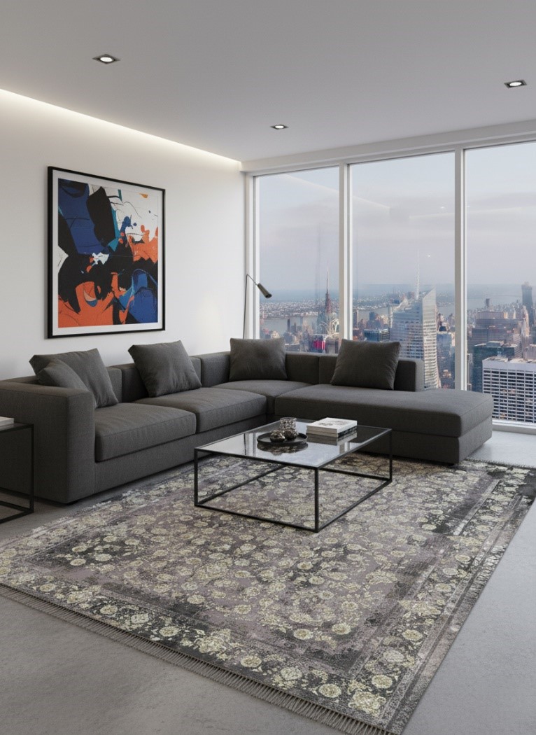
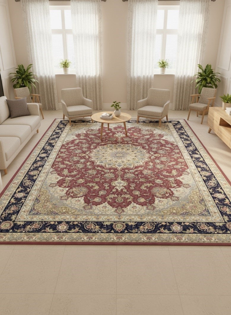
2.3. Interacting with Curtains

Curtains and carpets are often known as the "power couple" in decoration due to their vertical and horizontal positions.

  • Color Matching: You can match the main color of the curtains with one of the secondary colors in the carpet's pattern. This method creates a subtle cohesion in the space. For patterned curtains, it is best to match the dominant color in the curtain pattern with the main furniture color or the carpet's accent color (such as the color of the carpet's flowers).
  • Pattern Balance: If your carpet is richly patterned and traditional (like authentic Persian rugs), the curtains should be simple, solid-colored, and made of a delicate texture (like sheer or plain linen) to prevent visual overload. If the curtains are patterned, choose solid-colored carpets or those with very faint, minimal designs (like abrash or vintage patterns).

3. Environmental and Cultural Considerations: Light, Dimensions, and Lifestyle

Successful designers never make color choices without considering the physical conditions of the space.

3.1. Room Light and Dimensions

  • Small or Dimly Lit Rooms:Confirming the view of Architectural Digest, light-colored carpets (cream, beige, pearl white) and transparent or light-colored curtains make the space appear larger, brighter, and more airy. These carpets reflect ambient light (natural or artificial), aiding the visual illusion of expanse.
  • Large or Bright Rooms: In spacious areas, you can more boldly use dark carpets (lacquer red, navy, dark brown). The dark color makes the space feel warmer, cozier, and more defined, adding a sense of grandeur.

3.2. Usage and Lifestyle

  • High-Traffic Areas (e.g., Living Room and Hallway): For areas exposed to high dirt and traffic, carpets with medium or dark colors and busy patterns (like Persian designs) are a practical choice, as they show less dirt and staining.
  • Cultural and Traditional Focus: In Iranian decoration, richly patterned carpets with traditional colors like lacquer red, navy, and cream hold a central place. For harmony, the main background color of the carpet (e.g., lacquer red) is usually repeated in the details of the curtains and cushions, and the furniture is chosen in a neutral color (such as beige or wood brown) to keep the focus on the carpet.

4. Modern Color Palettes and Design Trends

A review of design trends in publications like Elle Decor shows that today's color palettes focus on the balance between neutral colors and nature-inspired tones:

  • Navy & Beige: A classic and chic combination. Light beige or cream carpets with navy or cobalt blue furniture create a strong, clean, and timeless contrast. This palette, paired with simple white or beige curtains, lends a coastal and luxurious feel.
  • Gray & Blush/Dusty Pink: Gray is the dominant neutral color in the carpet and furniture, fused with dusty pink as an accent color (such as in cushions and curtain details). This combination creates a modern, soft, yet sophisticated and up-to-date space.
  • Earth Tones: The return to nature is evident in 2024 trends. Using carpets with earthy, terracotta (reddish-brown), olive, and warm brown colors, combined with cream or bone-white furniture, brings a calm, intimate, and organic atmosphere.

Conclusion: A Unified View in Decoration

Choosing a carpet color in relation to furniture and curtains is more than a simple purchasing decision; it is a strategic step in interior design. Decoration experts emphasize that all three elements—carpet, furniture, and curtains—must be in a logical "visual dialogue." This dialogue can be based on shade harmony to create calm, or complementary color contrast to create dynamism.

The general principle is to spread the colors across the three layers of the space: the ground (carpet), the body (furniture), and the drapery (walls and windows). The neutral element (often the carpet or walls) provides the main canvas, while accent colors (cushions, artwork, and carpet patterns) define the space's personality. By considering the room's dimensions, light levels, and lifestyle, these color theory principles can be used as a powerful tool to create a balanced, beautiful space that aligns with high international design standards.

Mashad carpet, with a treasure trove of color and pattern rooted in Iranian tradition and authenticity, is more than just a floor covering; each piece is a canvas that brings your desired harmony to your decor in every design and color. Whether you seek the grandeur of authentic lacquer-red and navy patterns or the softness of modern designs and neutral colors (cream, gray), we guarantee that Mashad carpet, with the highest variety in quality, pattern, and color, is the exact missing element that will complete your space. With Mashad carpet, forget limitations in color and taste, and step into a world of unparalleled choices.

Related posts
The Art of Harmony: A Comprehensive Guide to Choosing Carpet Colors Based on Furniture and Curtains

در معماری و طراحی داخلی، فضا تنها مجموعه‌ای از اجزای کاربردی نیست؛ بلکه بوم نقاشی‌ای است که احساس، شخصیت و سبک زندگی ساکنان را به تصویر می‌کشد. سه عنصر کلیدی که به طور هم‌زمان ساختار و روح فضا را تعیین می‌کنند، فرش (کف‌پوش)، مبلمان، و پرده هستند.

Journey Through the Threads of History: The Origin and Evolution of Carpets Worldwide (With a Focus on the Persian Rug)

ریشه‌های قالی از حصیرهای ساده عشایر در آسیا شروع شد و به اوج شکوه دربار پادشاهان ایران رسید. شاهدی محکم‌تر از قالی پازیریک نداریم؛ شاهکاری با قدمت ۲۵۰۰ سال که نقوش آن مو به مو با حجاری‌های تخت جمشید همخوانی دارد. این یعنی هنر قالی‌بافی در دوران هخامنشیان به کمال رسیده بود!

(0) Comment
Submit your comment

Your comment has been successfully submitted and will be displayed on the site after approval

Subscribe to Mashhad Carpet Newsletter